Tracking
 Nathan Hollis
·
2 min read
Nathan Hollis
·
2 min read
What Is First-Party Data? A Simple Explainer
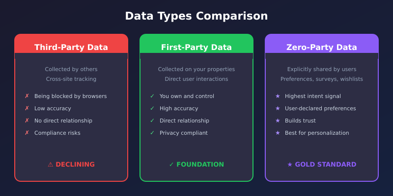
First-party data is the information a website gathers straight from its own visitors. You collect it yourself, on…
Looker Studio is a free tool from Google. It takes the numbers about your website and turns them into a clear picture. Think charts and simple cards instead of long lists. And the picture updates on its own, so it’s always current.
It used to be called Google Data Studio. Same tool, new name. You don’t pay for it, and you don’t install anything. You just open it in your browser.
Here’s the key idea. Looker Studio doesn’t keep any of your data. It reads it from somewhere else and shows it to you.
Think of it like a window. The window doesn’t own the view outside. It just lets you see it clearly. Looker Studio is the window. Your real data lives behind it, in a tool like Google Analytics.
Because of this, the picture is never stale. Every time someone opens it, the tool checks the latest numbers and draws them fresh. No one has to send out a new spreadsheet each week. The link always shows today’s numbers.
This also means it can’t fix anything by itself. It only shows what’s already there. If your data has a problem, the chart will show that problem too. Looker Studio is the messenger, not the fixer.
Say your site got these visits over three days:
As plain text, that’s hard to feel. In Looker Studio, those three days become a small line chart. You glance at it and see the dip on Tuesday right away. Same numbers, but now they tell a story in one look.
It’s great when you need to share results with someone else. A boss, a client, a teammate. They don’t have to log into anything complex. You send them one link, and they see a clean page they can actually read.
One thing to keep in mind. A pretty chart can’t fix bad data. If the numbers behind it are wrong, the chart will be wrong too, just nicer to look at. So make sure your tracking is set up right first.
The best way to get it is to open it. Go to Looker Studio, sign in with your Google account, and start a blank report. Connect it to your analytics, and watch your first chart appear. That one chart will teach you more than any guide.
Web analytics consultant with 15+ years of experience helping businesses turn raw data into actionable insights. Google Analytics certified professional and former analytics lead at digital agencies across the US. Regular contributor to analytics industry publications and conference speaker on privacy-first tracking strategies.
More about me →
First-party data is the information a website gathers straight from its own visitors. You collect it yourself, on…
The Realtime report in Google Analytics shows one thing: who is on your site right now. It only…

A conversion rate is just the share of visitors who do one thing you wanted. Maybe they buy,…